If you know me, you know that I believe in immersive spaces that are a conversation of color, texture, form, and function. Today, I want to focus on just one of those elements… COLOR.
Color is what helps blend your past, present, and future into one beautiful, livable story. It’s what can inspire emotion, action, and even inaction, for those moments when resting and escaping from the outside world are just what the doctor ordered!
To put it simply, color is the building block of our visual world, and without it, we would be living in a film noir — totally chic, but lacking in vibrance and substance. We can do better. Follow me into the world of color in interiors…
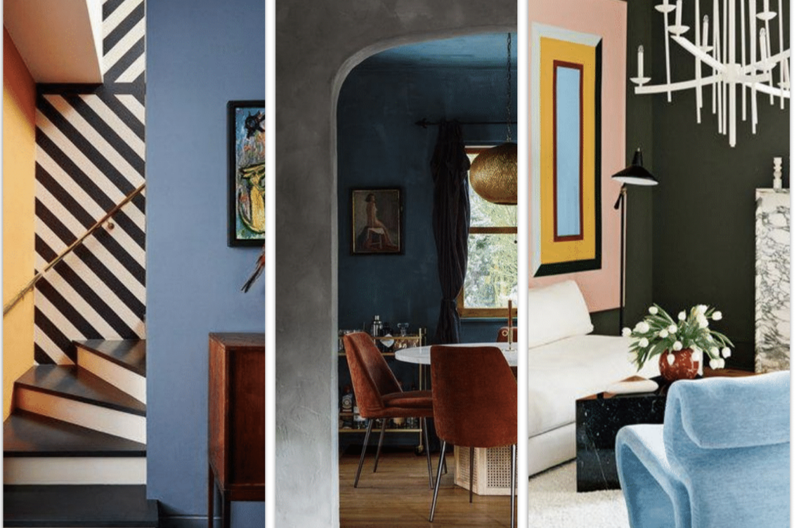
The Prevalence of Color in Design
Over the last 5 years or more, color has slowly been seeping back into interiors. After the decade-long grey trend of the early 2000s, we’ve seen a shift toward warmer neutrals, saturated hues, and color-loving spaces.
Although this shift was already well in motion before 2020, the arrival (and longevity) of the pandemic has steered us homeowners even further away from cold, sterile, hospital-like hues. Instead, the population is moving toward colors that offer feelings of security, warmth, comfort, and inspiration… and I don’t see this changing any time soon!
As someone who LOVES color (whether we go all-in or layer it subtly), I couldn’t be happier to see this shift. Which is why I was equally thrilled to see all of the colorful designs throughout the showrooms at High Point Market, the biggest design event in North America!
Custom color options for nearly every piece of furniture around — I’m in! Can’t you just imagine the potential??
To celebrate color and the many designs I saw at High Point Market, I thought it would be fun to “walk through the rainbow,” exploring the emotions and feelings each color is most known for inspiring. But before we dive in, a quick disclaimer…
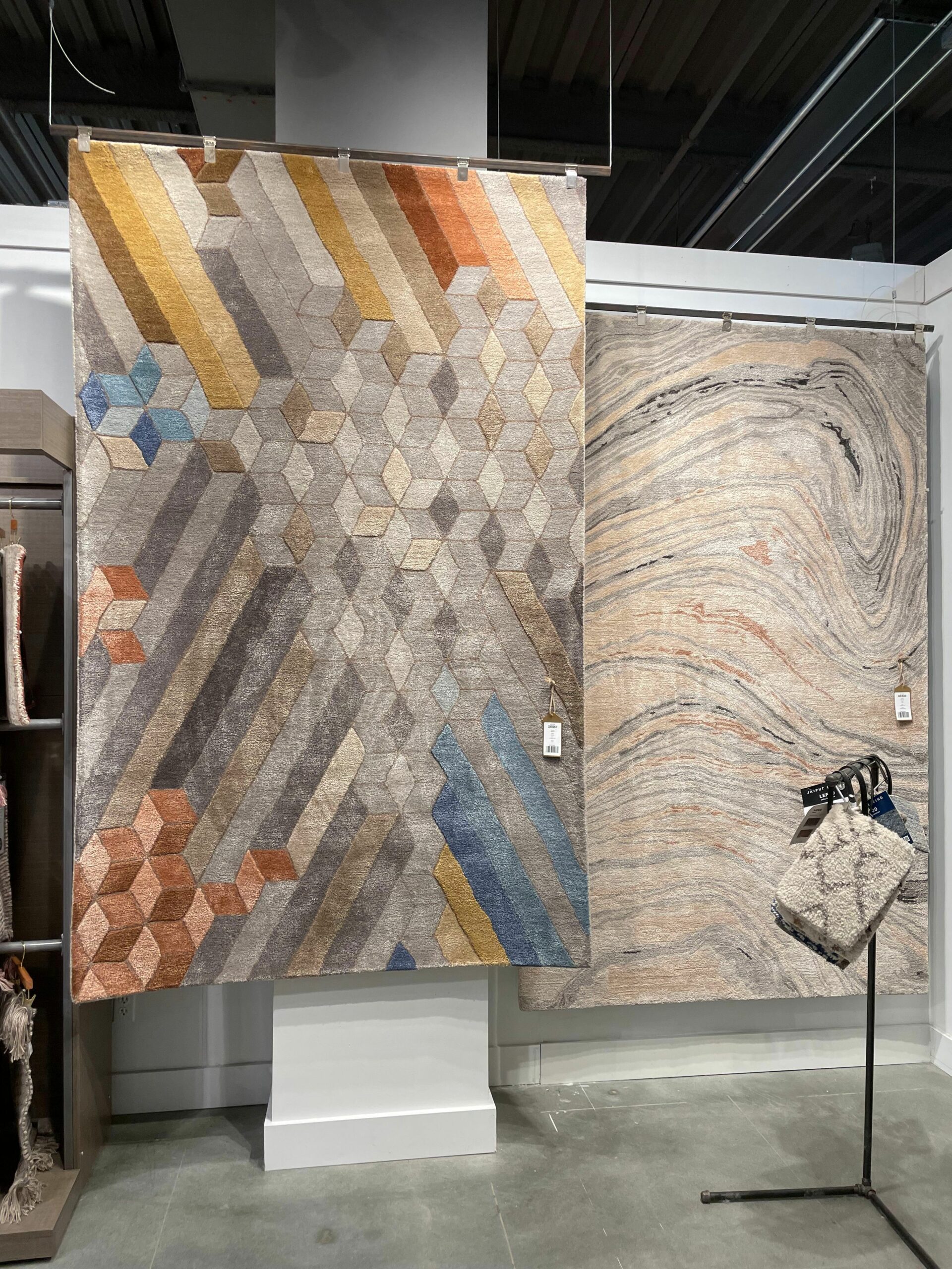 Stunning rugs at Jaipur Living
An Important Note on Color Perception Around the World
It’s important to note that color can inspire two people, and two cultures, in dramatically different ways. How you personally perceive color is almost entirely a result of what you have been exposed to throughout your life. For example, while Western culture may wear black to funerals and dress brides in white weddings, in Buddhist culture, white is considered the color of mourning. Big difference!
The color associations I am sharing below are predominantly Western associations, and general associations at that, not to be taken as fact. At the end of the day, it is entirely up to YOU to decide how you feel about color and how you want to experience it in your home. (If you need help, reach out to me here and I will help you with that discovery!)
Ready? Let’s go…
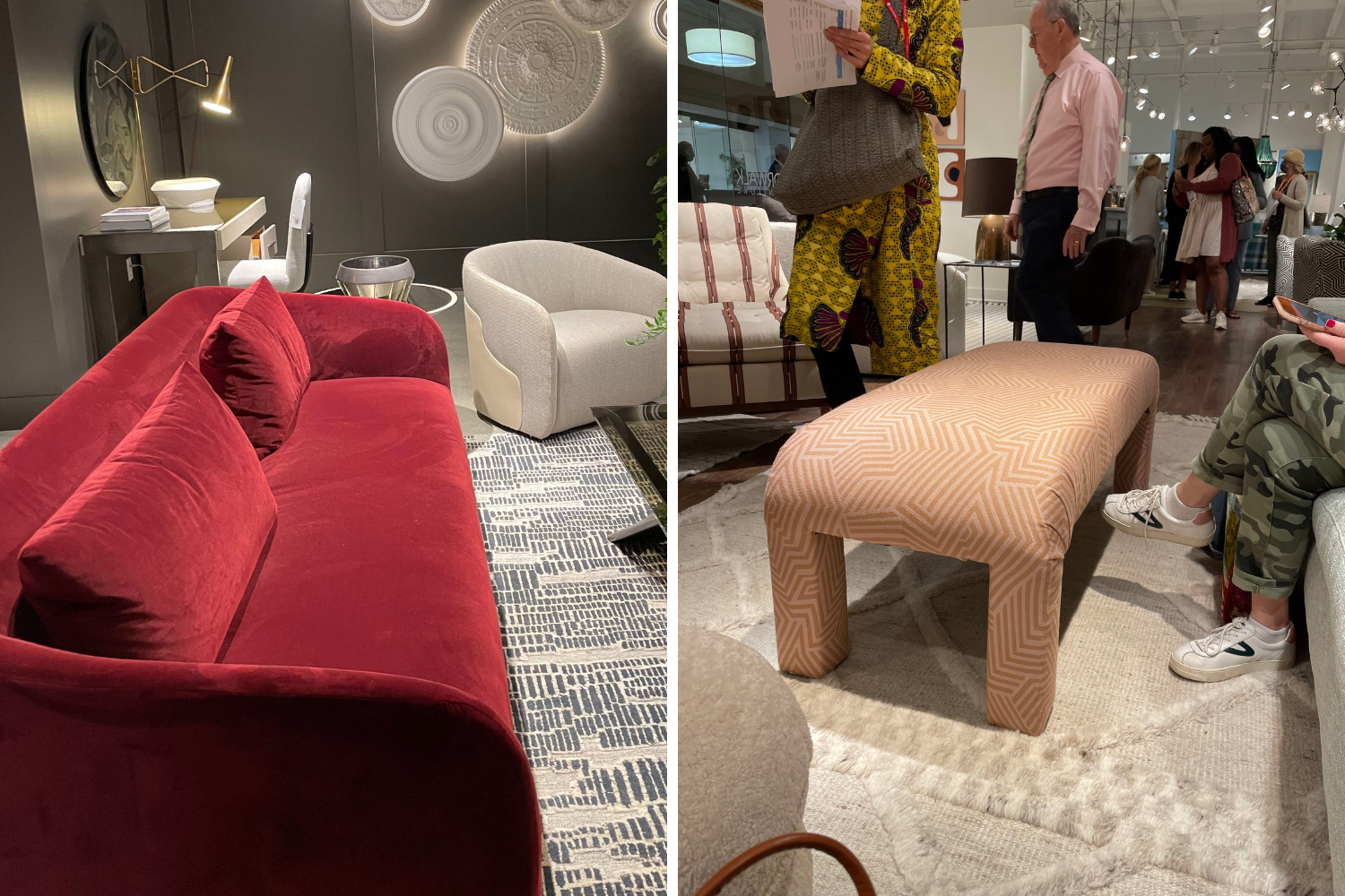
Red & Pink
Makers from left to right: Universal Furniture and Norwalk Furniture and Crypton Fabric
Variations: Crimson, ruby, burgundy, brick, vermillion, rose
Moods: Deeper reds, like ruby and scarlet, are most commonly associated with passion, strength, romance, and confidence. These colors offer depth that can feel both commanding and inspiring in a space. Meanwhile softer shades of reds, like rose and pink, are considered more approachable, friendly, and playful. Depending how you use them, they can blend into a room or stand out.
Orange & Brown
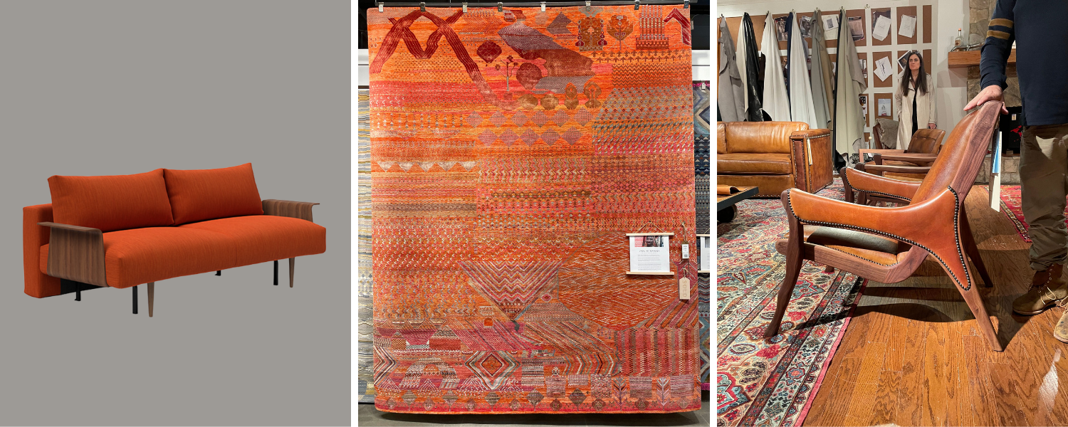 Makers from left to right: Innovation Living, Jaipur Living and Sherrill Furniture
Variations: Tangerine, amber, cinnamon, bronze, terracotta, bronze, apricot, leather
Moods: Orange is typically considered a social color, with brighter variations believed to inspire conversation and adventure. However, deeper tones of orange, like those commonly found in nature, are believed to create feelings of warmth, connection, security, and groundedness.
Yellow & Gold
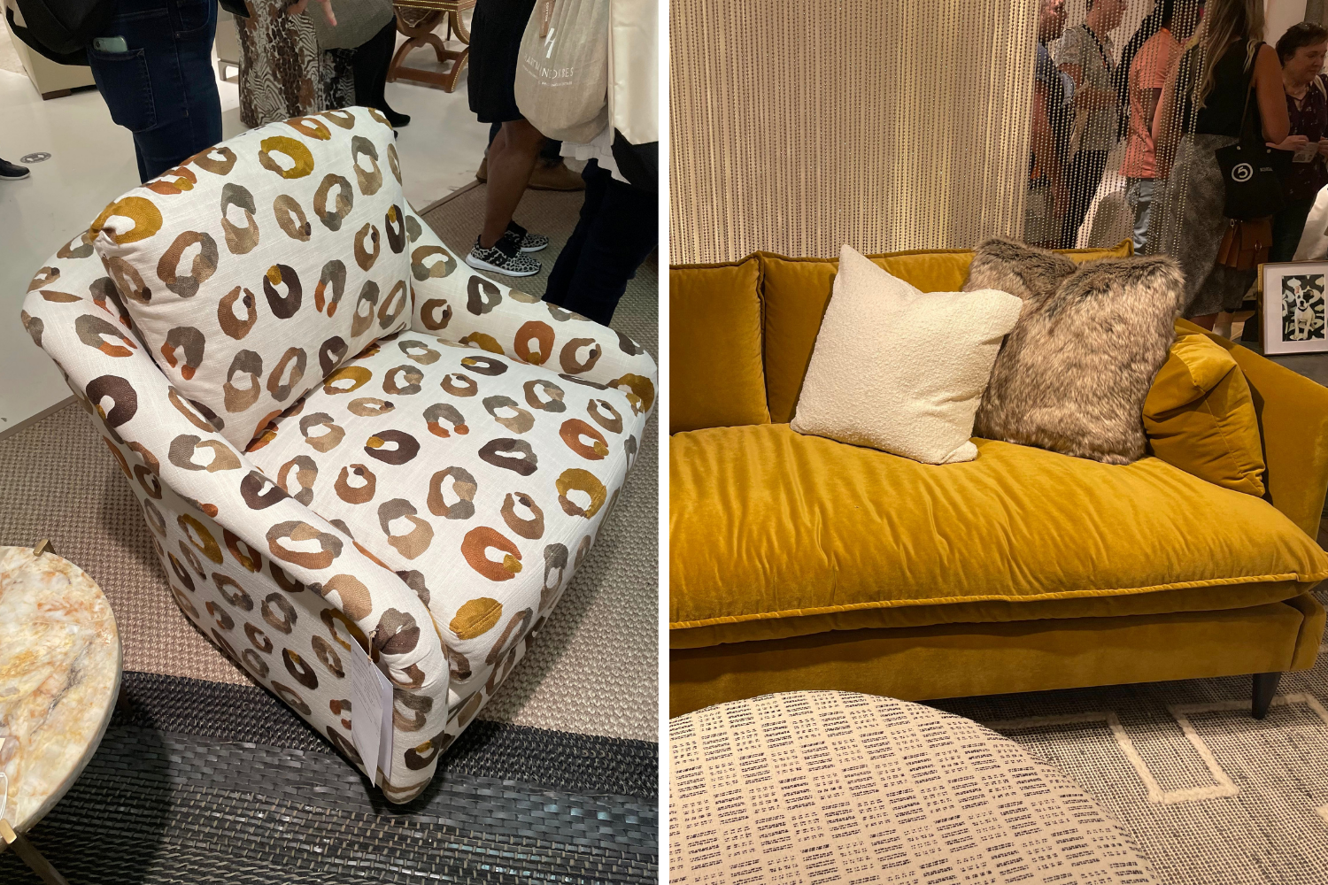
Makers from left to right: Sherrill Furniture and Norwalk Furniture and Crypton Fabric
Variations: Daffodil, lemon, butter, mustard, ocher, saffron, brass, topaz
Moods: Brighter yellows are generally considered happy colors, and like brighter oranges, are thought to help inspire conversation and cheer in social spaces. Deeper yellows, like mustard and even brass (the metal), have a darker side, often being associated with cowardice or deceit. However, I think this is an unfair association. Gold is also the color of royalty and luxury — so you decide how you want to perceive it or use it in your home!
Greens
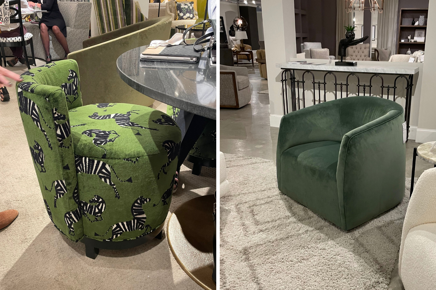
Makers from left to right: Norwalk Furniture and Crypton Fabric and Hooker Furniture
Variations: Emerald, olive, grass, sage, lime, mint, forest, chartreuse, jade
Moods: Overall, the color green is largely attributed to feelings of health, restoration, wellness, and balance. While lighter greens may be associated with new life and fresh beginnings, darker forest greens can conjure up feelings of safety, groundedness, and peace. I personally love using green in spaces, either incorporated as a standout piece (like this project) or with live or faux greenery.
Blues
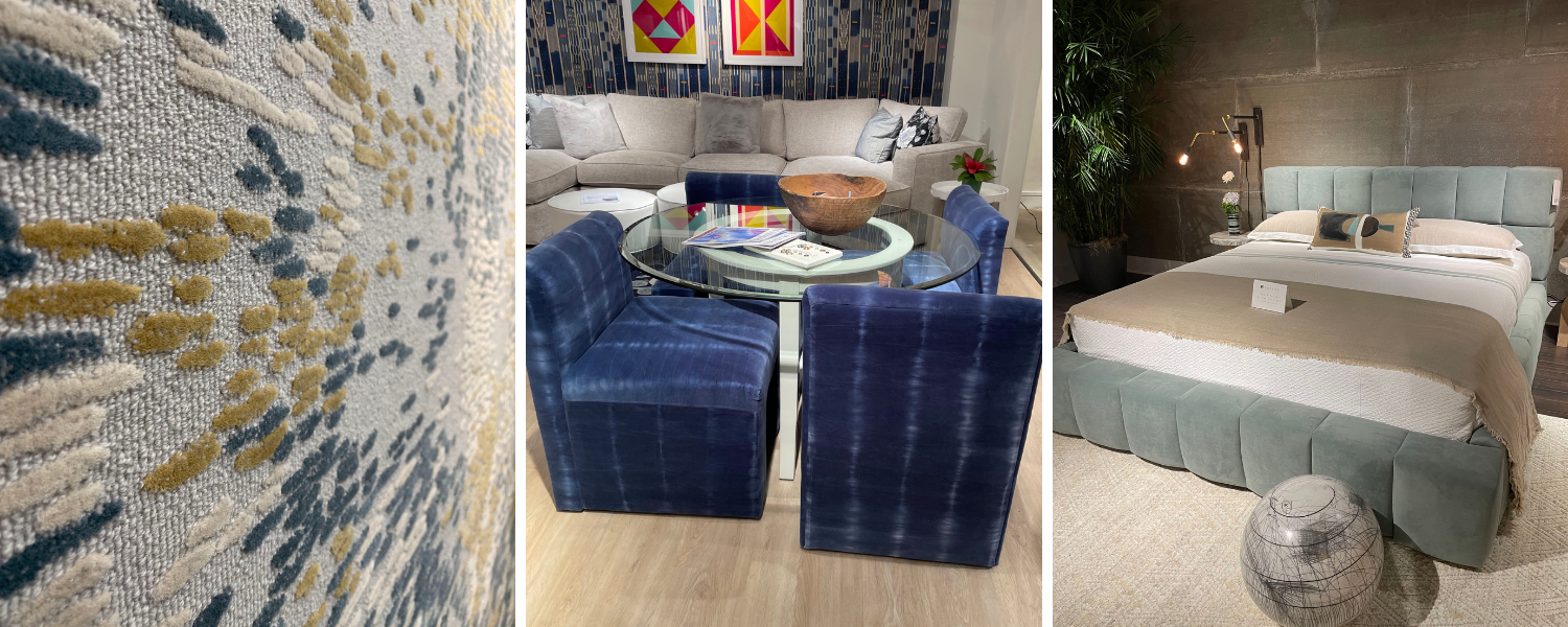
Makers from left to right: AREA by Edwards Fields, Norwalk Furniture and Crypton Fabric, and Universal Furniture
Variations: Sapphire, cobalt, cerulean, azure, indigo, teal, navy, sea foam
Moods: Blue is one of the most common colors used in American homes, and it’s no surprise — depending on the shade, it can feel relaxing or inspiring, light-hearted or serious, airy or grounded. Because there are SO many shades of blue, it is really up to you to decide which feel right for which spaces in your home.
For example, you may prefer a grounded living room but a relaxed, airy bedroom. The blues you choose depend on the emotions you are likely to feel from them. My best advice? Get out into the world and explore how you perceive color!
Purple & Violet
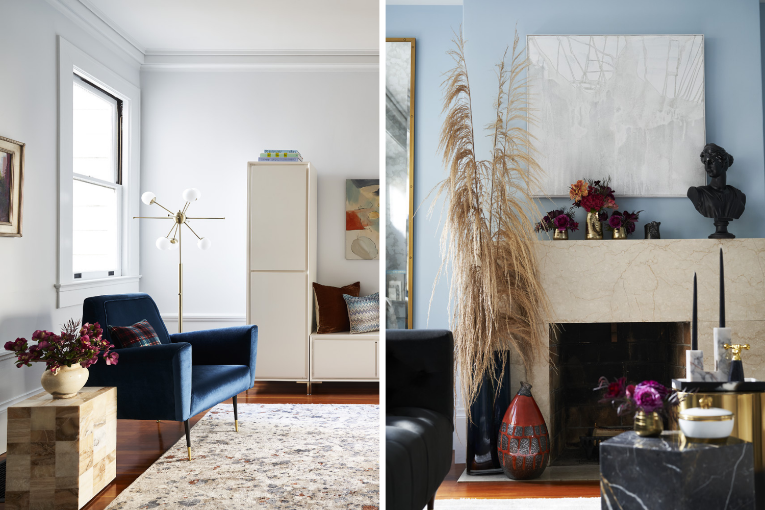
Variations: Violet, lavender, periwinkle, lilac, magenta, mauve, amethyst
Moods: Purple in general is considered the color of luxury, mainly because it was so expensive to make that only royalty could afford it! Now, deep purple shades are still associated with high-end style, creativity, and even celestial vibes. Lighter purples, like pinks, sit at the other end of the spectrum and are most likely to channel a playful, light-hearted feel into your space.
To be honest, I didn’t see many (or any) purple decor at High Point Market this year, but that doesn’t mean it doesn’t belong in your home. If you love it, we can make it work! (Like I did in the home above.)
How to Explore Color
The best way to explore color is to experience it for yourself and take note of how it makes you feel. I personally love to get inspired by fashion, high-end hotels and restaurants, and sultry cocktail lounges (and the cocktails themselves!).
While I love flipping through a glossy magazine nearly as much, there’s something to be said for that visceral feeling you get when immersed in colorful fabrics and spaces. Try it for yourself and see how you feel! Again, if you need help discovering and expressing your story in your home, I would be delighted to help. Reach out to me here and let’s get to know each other!
Xoxo,