How Color Changes the Way a Room Feels
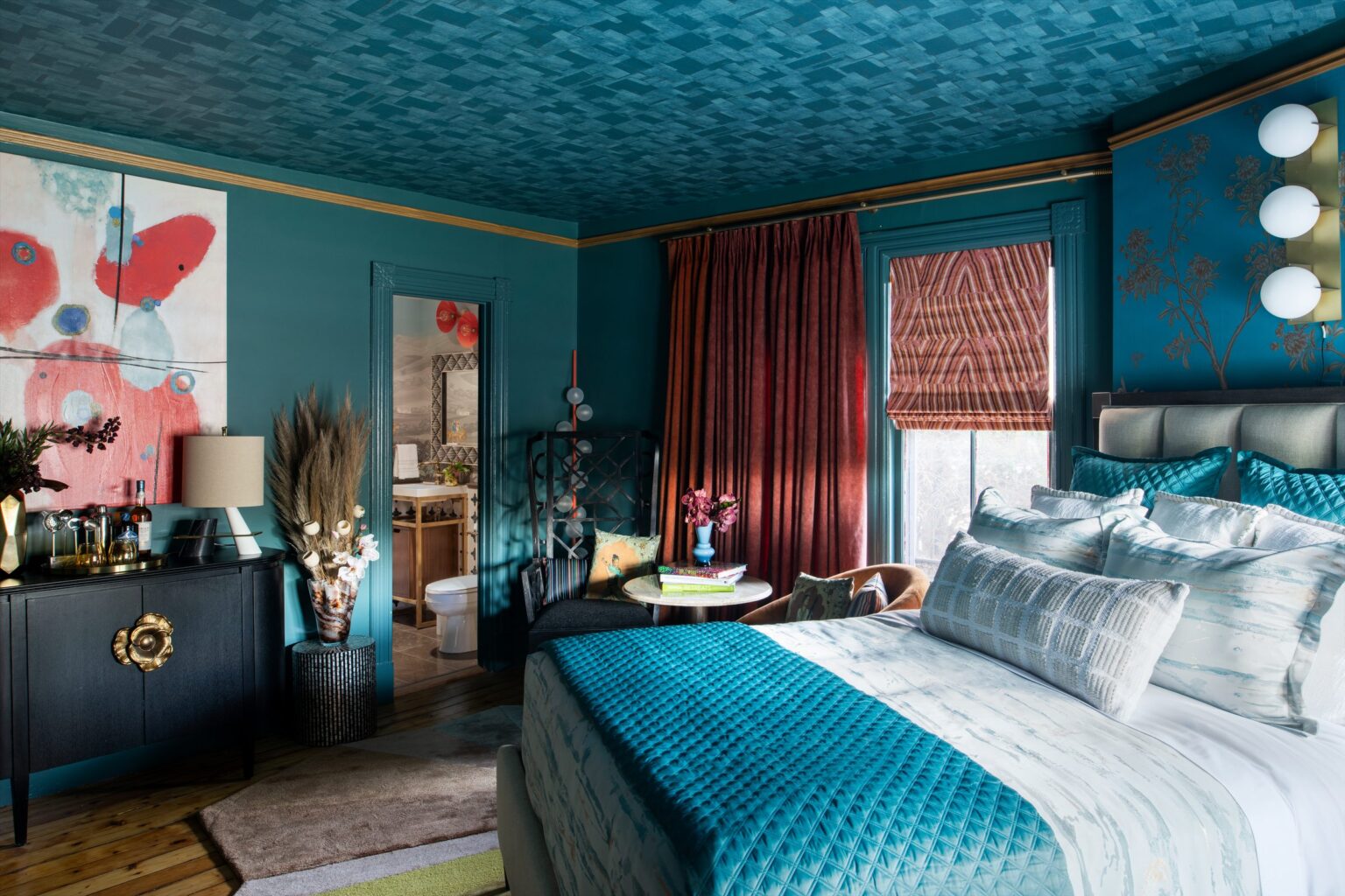
How color affects mood in a room has very little to do with the color itself and almost everything to do with three other things: how much of it there is, what light falls on it, and what the room is for. The same blue that settles one bedroom will make another feel like a waiting area.
Which is why the advice you have read — blue is calming, red is energizing, green is restful — keeps failing you in practice.
Why “blue is calming” is not useful advice
Those associations are not wrong, exactly. They are just radically incomplete, in the same way that “salt makes food taste better” is true and tells you nothing about how to cook.
Color behaves differently at different quantities. A deep teal on one wall reads as a considered accent. The same teal on four walls and the ceiling stops being a color and becomes an atmosphere, which is an entirely different proposition and usually a better one. Most people stop at the accent wall, get a result that feels tentative, and conclude they are bad with color.
Color also changes with the light it is standing in. A north-facing room in Los Angeles and a north-facing room in London are not the same room, and a paint that is chalky and soft in one will go grey and sullen in the other. This is why the sample you loved in the store disappointed you at home, and it is not your eye failing. It is a different light.
The three things that decide how a color reads
| Quantity | An accent reads as a decision. A whole room reads as a mood. Half-measures read as uncertainty. |
| Light | Direction, time of day, and what is outside the window. A green garden throws green into a room all afternoon. |
| Purpose | What you do in the room, and for how long. A color you pass through can be far bolder than one you sit inside for three hours. |
Run any color you are considering through all three before you run it past anyone’s opinion. Most disagreements about color are actually disagreements about one of these, unnamed.
Build a color story, not a color scheme
A scheme is a set of colors that coordinate. A story is a set of colors that mean something, and it is a far more reliable way to arrive at a palette that still feels right in five years.
The difference in practice: a scheme starts at the paint display. A story starts with a question — where is this family from, what do they do in this room, what do they want to feel when they walk in at the end of a day. The answers produce colors you would not have picked from a fan deck, and they hold up, because they are anchored to something that does not go out of fashion.
A palette drawn from a grandmother’s wedding sari, or from the particular green of the hills someone grew up looking at, will almost always beat a palette drawn from a trend forecast. Not because it is more beautiful. Because the person living there can explain it, and that is what makes a room feel like someone’s rather than anyone’s.
What actually matters, room by room
| Room | The question that matters most |
| Bedroom | What does this look like in lamplight? You are rarely in it in full daylight. |
| Kitchen | What does food look like against it? Some greens and greys make everything look unappetizing. |
| Hallway | What are the two rooms either side? A hallway is a transition, not a destination. |
| Living room | How does it hold up at 7pm with the lights on? That is when it is most used. |
| Home office | What is behind you on camera, and does it flatter your face in the light you actually have? |
| Small room | Does light or dark serve it better? Both work. Timidity does not. |
Common questions
What color makes a small room look bigger?
Neither white nor dark reliably does it, and the premise is slightly off. White can make a small room feel like an unfinished box. A deep, saturated color can dissolve the corners and make the edges ambiguous, which reads as more space, not less. What actually enlarges a small room is consistency — walls, trim and ceiling in one color, so the eye finds no boundary to measure.
Can I use dark colors in a room with little natural light?
Yes, and it is often the better answer. A dark room fighting for brightness tends to look grey and apologetic. A dark room that accepts itself — deep color, good lamps, warm bulbs — becomes the room everyone wants to sit in at night.
How many colors should one room have?
Three ranges is a reliable working number: a dominant, a supporting, and something that interrupts. But count ranges, not paint names — five woods and three textiles in the same family count as one.
Should ceilings always be white?
No, and the default white ceiling is one of the most common missed opportunities in a home. A ceiling in the wall color, or a half-shade lighter, removes a hard line most people do not notice until it is gone.
How do I test a paint color properly?
Paint a large sample — at least two feet square, two coats — on a loose board rather than the wall, so you can move it. Look at it on the wall that gets the most light and the one that gets the least, in the morning, and again at night with the lamps on. Live with it for three days. Most regrets are decided in the first ten minutes.
Does color really affect how people feel?
It affects how a space feels to be in, which is a more honest way to put it. We are not psychologists and will not quote you a study. What we can tell you from building rooms is that quantity, light and purpose predict how people respond far more reliably than any color’s reputation does.
Where to start
Before you choose a single color, answer the three questions above for the room in front of you. Most people discover the decision was never really about color.
If you want to see how a palette gets built from a story rather than a swatch, our approach sets out how the sensory layer follows the spatial one, and this essay on what real luxury means gets at why the anchored version lasts longer.