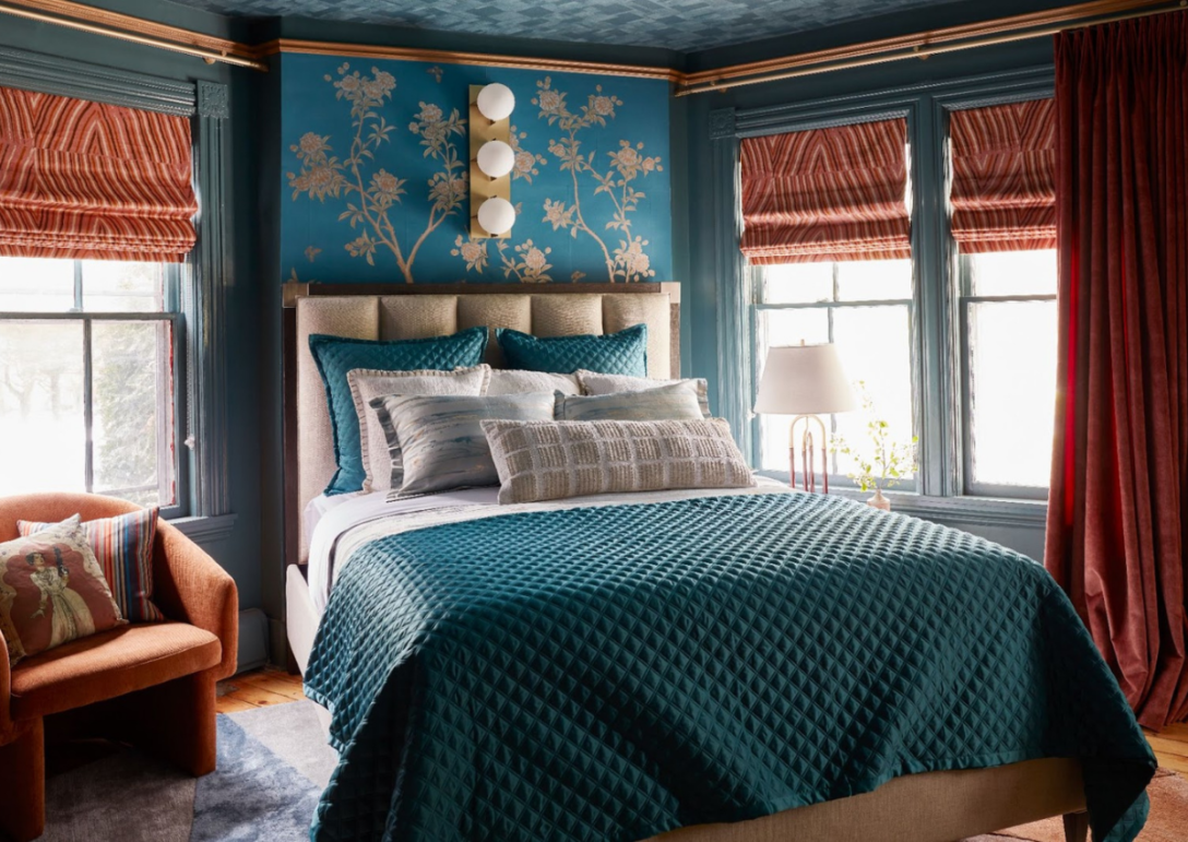
Last month, I introduced you to the Kaleidoscope Project, a total design takeover of the Berskires’ Cornell Inn, where designers from diverse backgrounds met to reimagine each and every room of this historic retreat.
At the time, I had only given you a peek at the inspiration behind my room, which I have fondly dubbed The Empress’s Quarters. Using a mix of bold color, luxurious textiles, and vibrant patterns, I envisioned a one-of-a-kind place…
…a place where the everyday becomes extraordinary, where Past collides with Present and Future, and where guests (like you!) will feel like royalty.
I’m proud to say that the room is finally complete — and it’s time to share it with you!! Grab the Champagne, click glasses with me (*clink!*), and let’s walk through each of the details that set the stage for royalty, beginning with the stage itself…
P.S. This room would NOT have been possible without the many sponsors who donated their products and time to this project. I will be mentioning them throughout this post and hope you will join me in applauding them for their efforts in supporting such an inclusive and incredible cause! Thank you, everyone!!
Setting the Stage: A Warm Yet Infinite Colorway
Credit: Lauren Pressey
Ahhh…. breathe it all in. I know each guest will have their own experience in this space, but to me, this space feels limitless and expansive yet comfortable and cozy. Rich and luxurious yet personal and playful. Restful and moody yet invigorating and social.
It’s a symphony of delightful contradictions that I can’t wait to sink my toes into or pour a cocktail and enjoy. Do you feel it, too?!
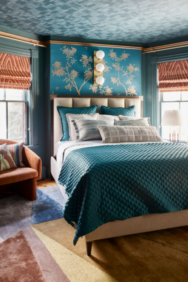
The first thing you probably noticed… color. This saturated yet relaxing blue-teal color is from Benjamin Moore and creates the perfect cozy cocoon in which to while the day away in luxury. I chose gold for contrast in the molding and to help bring out the other metallic elements for the room. Not to be missed, the ceiling…
Credit: Frank Francis
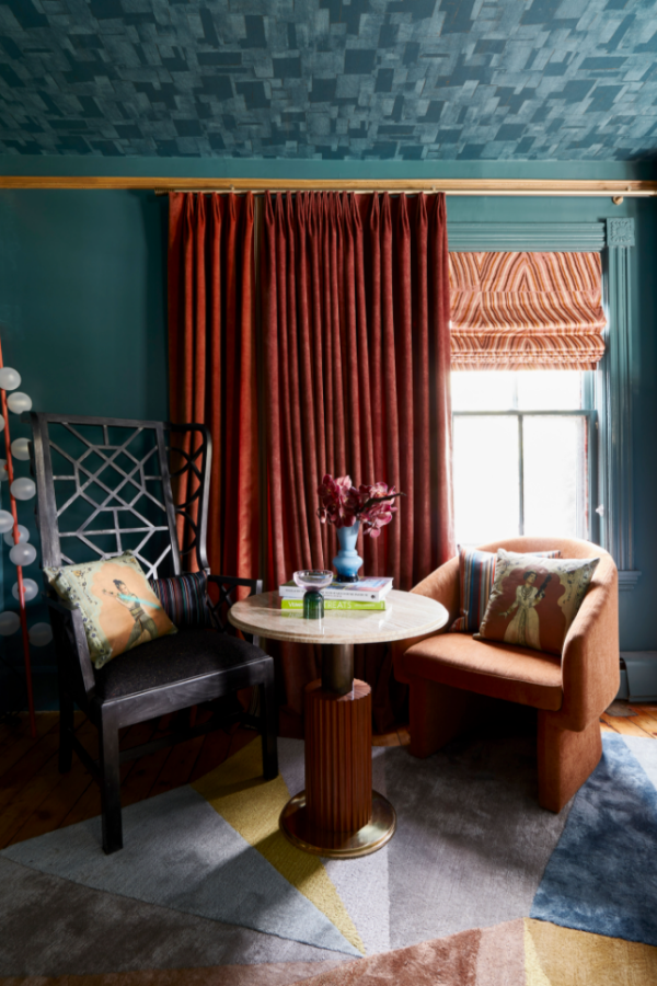
Between you and me, I have always wanted to wallpaper a ceiling, and being invited to this project was the moment when I knew I could make that happen. (Hello, free reign!) Yes, it was a risk, but boy, did it pay off! Adding this contemporary wallpaper by Kravet brought sooo much interest to the otherwise plain ceiling and made the room feel spacious yet extremely cozy.
Credit: Scott Morris
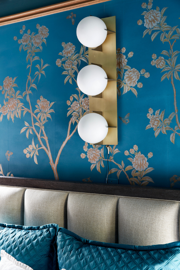
I also chose this hand-painted wallpaper above the bed (by the endlessly talented Gracie) with metallic details, using it to tie together all the other metallic elements in the room. It’s also the most traditional-looking element in the space, seamlessly balancing the contemporary ceiling wallpaper and Roman shades. Which brings me to…
Credit: Scott Morris
The Show-Stopper: Opulent Fabrics & Textiles
If you look at the spaces designed for royalty in centuries past, you’ll find common design themes: stunning natural stone in public spaces (think the Taj Mahal), a mix of shiny everywhere (pick literally any palace), and luxurious textiles in private spaces (think drapery and velvet settees in the Palace of Versailles).
The crown may sit heavy on the head of the queen, but she sits in comfort! 😉
In fact, growing up in Kuwait (and in my native India, too), we always, ALWAYS had amazing drapery with beautiful details and luxurious fabrics, such as velvets and brocades. You may wonder why, oh why, would hot countries with 100+ degree heat use velvet indoors, but they actually keep the heat out, work really well as blackout shades, AND look very opulent!
Credit: Frank Francis
When it comes to designing a room, you always have to consider what’s already there that you will have no choice but to get creative with. In my room’s case, it had not four but FIVE walls! This diagonal wall is small and rather awkwardly positioned, and I knew immediately that the bed would have to go there.
Fortunately, these two bedside windows are precisely placed to add in plenty of natural light. Unfortunately, this room is also the very first room when you enter the inn… meaning that it faces the main road and would need some serious considerations to privacy. Done and done. (Remember when I said velvet was great for blackout shades? Now you’re getting the idea!) So…
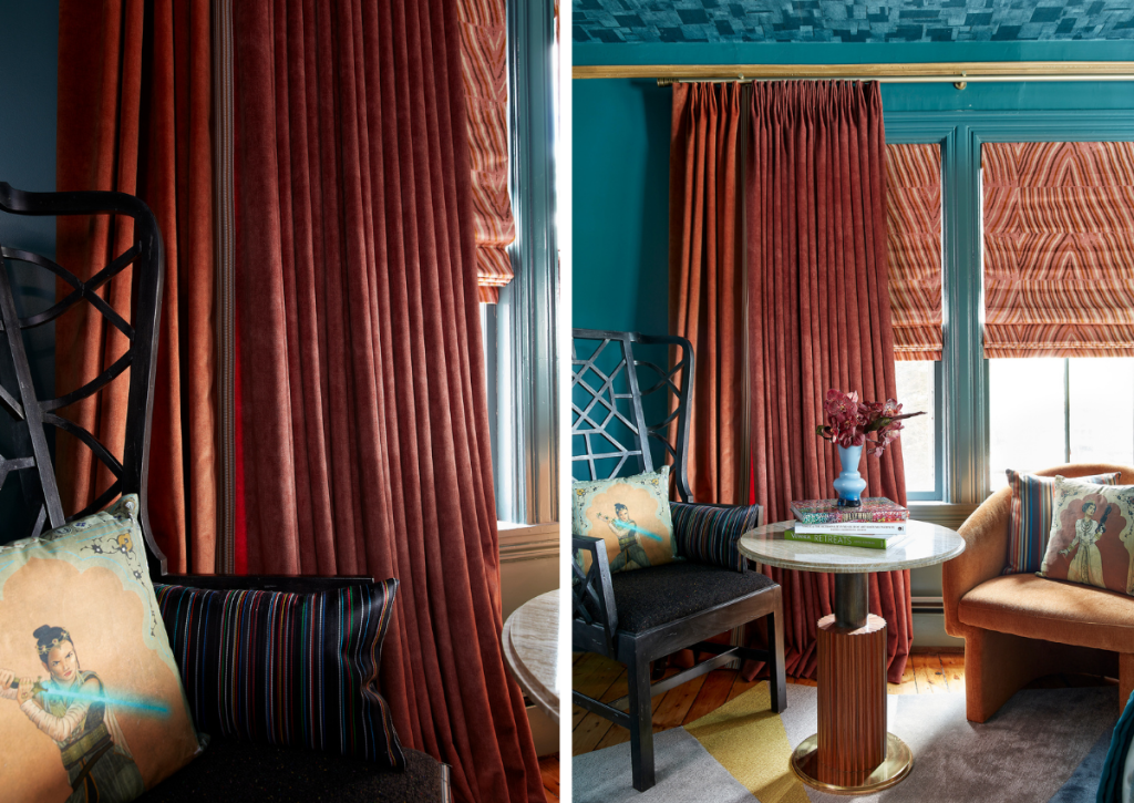
I selected this beautiful fabric from Lee Jofa from the Kelly Weasrtler line with these agate-like geometric patterns as my shades, working with The Shade Store to make them by hand. I combined them with these lush, soft velvet drapes (also custom-made) from Clarke and Clarke. You can see how luxuriously heavy they are, which adds such a spectacular drama to the room.
Both the shades and the drapery (and this stunning brass rod) frame both sides of the bed, making rest and relaxation the focal point of the room.
Bed & Furnishings Fit for a Queen
Credit: Frank Francis
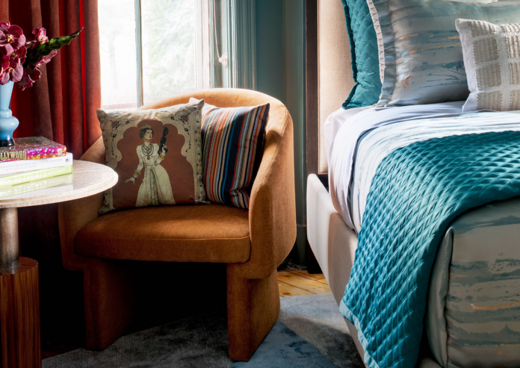
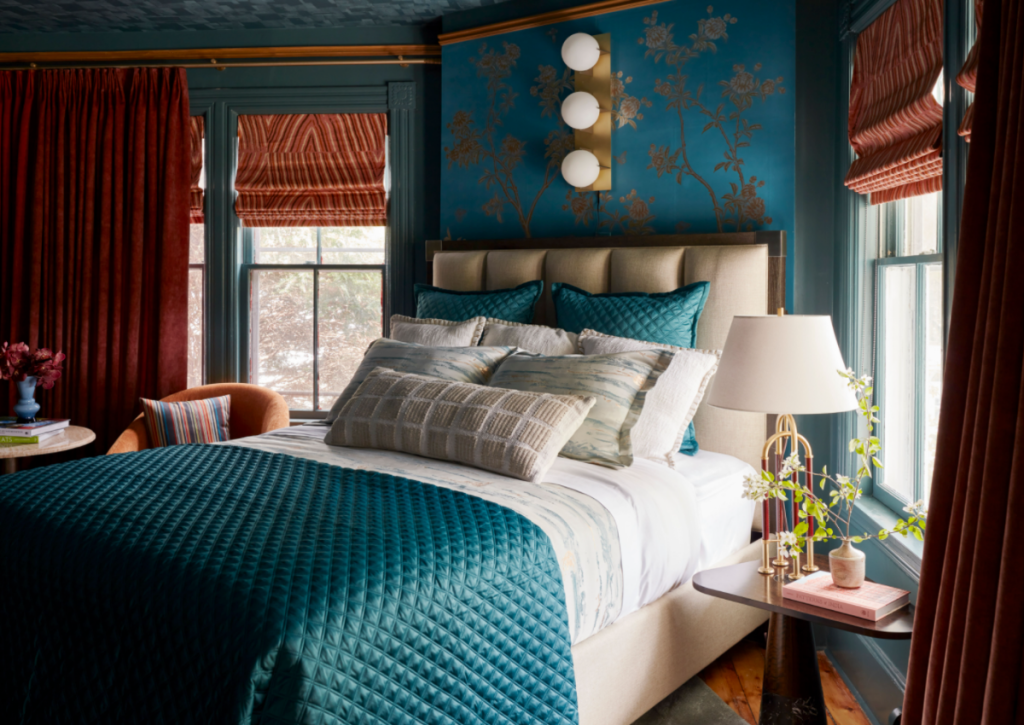
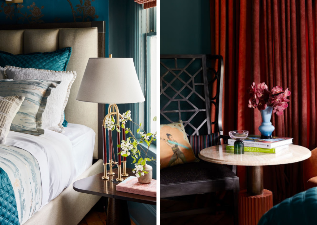
So… let’s talk about this bed, shall we? The bed, the wingback chair (shown two photos up), and both side tables were donated by the incredible Theodore Alexander, one of my exclusive sponsors. Their collections and designs speak very true to my aesthetic and modern yet timeless style, and they were also a delight to work with!
The bed especially looks like it was meant for an empress. It is beautifully tufted and the quality is bar none. My room had a lot of bold elements in terms of color, so I kept the bed neutral to stand its ground, and stand, it does. 😉
It’s completed with a comfortable mattress donated by Saatva, luxurious bedding from Ann Gish (I couldn’t resist bringing in silk elements into the bedding to accentuate the regal feel), and this intriguing bedside lamp donated by Hudson Valley Lighting.
Everything royalty needs to take the world by storm.
Credit: Frank Francis
Speaking of Theodore Alexander’s side tables and chairs… this wingback chair exudes royalty. The room is very small in size, and I knew a traditional upholstered wingback would dominate the small space. Instead, this sexy piece boasts gorgeous architecture and modern geometric carvings. It pairs perfectly with their marble and stone side table and this modern orange armchair from Sunpan.
Of course, this reading nook setup gave me the perfect opportunity to bring in the accoutrements of a modern-day-meets-future princess — Leia and Rey pillows from Star Wars!
To underscore the futuristic feel, I ordered this contemporary floor lamp from Blueprint Lighting (on the left!). They let me customize the color to match the room!
OH — and I HAVE to tell you about this rug!! (Seriously, scroll up and give it a peek!) This was a very, very important element of the design. My room was such an odd shape that normal rugs would not work. A rectangular rug would hit against the fireplace… a circular rug would have ended up mostly under the bed… you get the idea… what to do?!
I always go to Jaipur Rugs when I am looking for something new and contemporary, and when I came across their ICONIC line of rugs — and this rug in particular — it was literally love at first sight! It had a unique shape and all the colors from this room’s palette!! It was literally meant to be.
In fact, people thought I had this rug custom-made for my room… need I say more? 😉
In-Room Cocktail & Beverage Bar
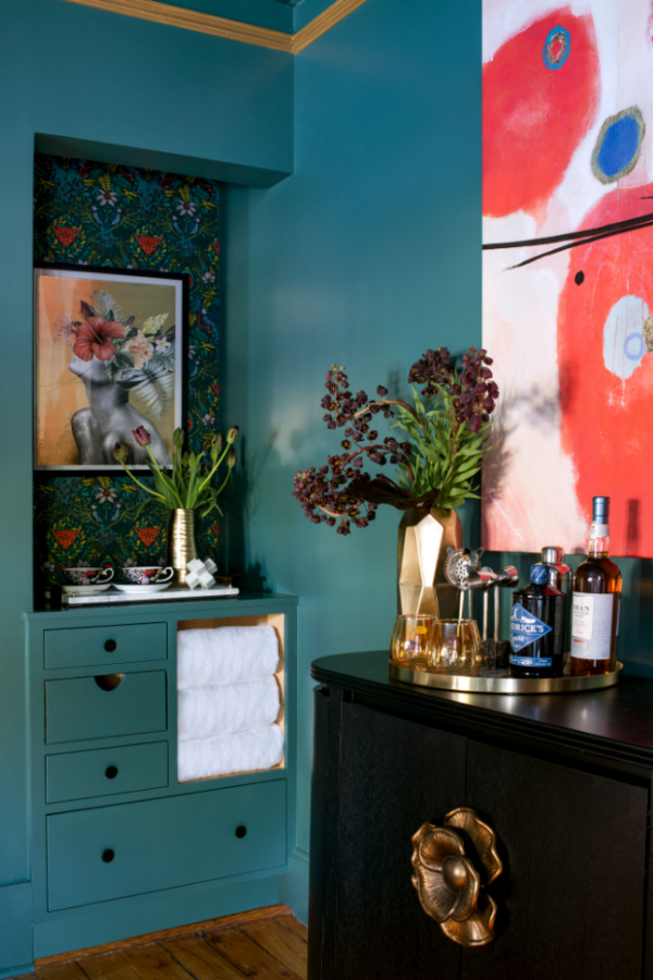
You know me… how could I design a space that didn’t offer an opportunity to sip cocktails in style? I couldn’t. Meet the cocktail corner, a staple of any empress’s 5 o’clock hour…
Credit: Lauren Pressey
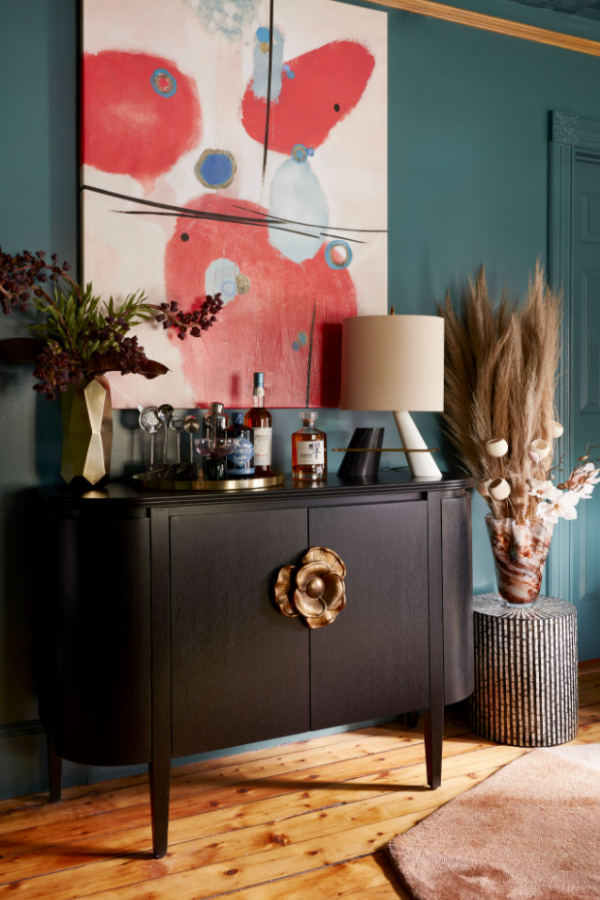
This small but inspiring nook uses wallpaper also by Kravet, has drawers for storage, and boasts sensual yet abstract art with a touch of the avant garde. To the side (set perfectly between the bar nook and the reading nook is this simple yet bold credenza bearing bar essentials…
Credit: Frank Francis
When I came across Currey & Co.’s credenza, I just knew it was the one! It’s petite enough to fit the scale of the space, yet holds its own with this oversized metal handle, wide body, and modern legs. It’s also the perfect base for this modern art piece I found at Iconic Pineapple. Adorable yet highly functional!
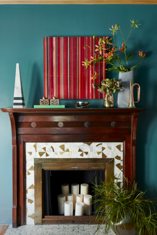
Last but not least, directly across from the bed is this feature of comfort and taste… a built-in fireplace. You don’t get that kind of luxury from any old hotel!
Credit: Frank Francis
As historic features of the Cornell Inn, the fireplace and floors were off-limits, and I was more than okay with that! I picked out the accents of gold in the fireplace surround to use in the rest of the room, and of course, decorated the mantle to bring all of the rooms design elements together: cool blues and spicy hues, luxe metals, and of course, rich patterned art for a touch of wow.
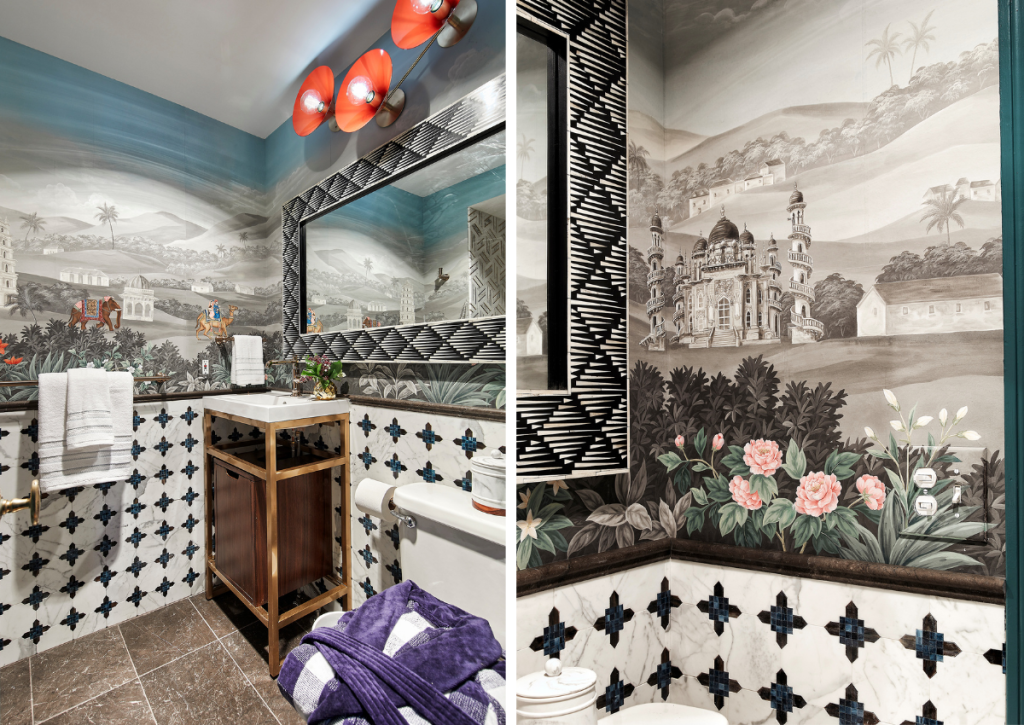
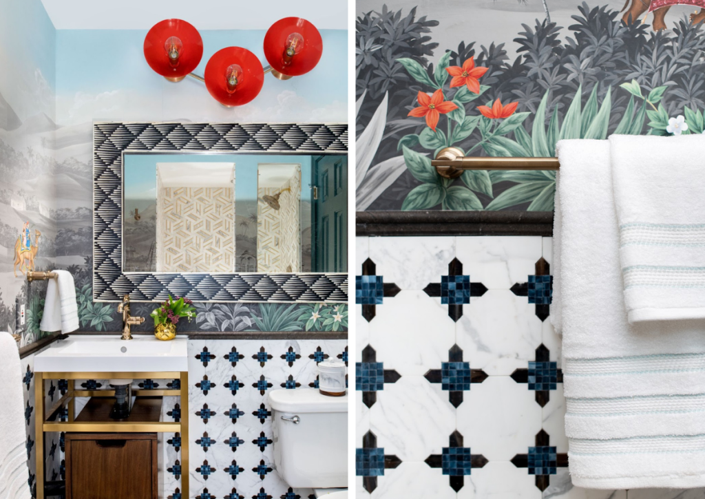
Whew! There’s a lot going on in there, right?! There’s a whole ensuite bathroom connected to this room that is just waiting for you to see it. I’ll give you a tiny peek now, but you’ll have to wait until my next reveal to see it all…
Sneak Peek: An Ensuite Bathroom Designed for Timewalking
Credit: Scott Morris
The showpiece is this Gracie hand-painted wallpaper. Yes, this wallpaper was hand-painted just for this room and it is enchanting! It is like timewalking back to the eras of Indian queens and Mughal princesses. Paired with a variety of intricate tile designs — from dark, grounding floors to Morrocan-inspired walls, to an all-stone shower (all from Akdo) — this design creates an experience that is worlds apart.
Credit: Lauren Pressey
The Curry and Co. oversized mirror with bone inlay and the futuristic Blueprint Lighting fixture (also custom-designed!) cap off the drama in style. Now THIS is where a queen readies herself for a day of luxury and greatness. 😉
Stay tuned for more views of this space (and the stunning shower) in my next post!
See you then,

