Imagine your favorite clothing boutique… how do you feel when you walk in? Do vibrant colors fill you with energy and excitement? Do dark hues make you feel sexy and confident before you even hit the dressing room? (I’ll take that!) Or maybe soft pastels put you instantly at ease?
Ask yourself the same questions about your favorite bar, and I think you’ll see a theme…
Color isn’t just what our eyes see. Color is feeling.
How to Set a “Mood” in your Home
Color psychology is fascinating, isn’t it? Color goes so much deeper than just what our eyes see as “beautiful.” Color has the ability to reduce stress, excite and energize, assist in relaxation, and so much more. Colors make us feel… they force a reaction… they prompt us to action… they set. the. mood.
Put simply, color psychology is a powerful tool with a profound impact on our lives! But how, exactly, can you choose the colors that will help you feel and live the way you really want to?!
Great question! And the topic of this week’s post…
Emotional Associations of Color in Your Home
Before we get into the process for exploring color in your world, it is helpful to understand the common psychological and emotional feelings commonly associated with each color.
As we go through each, keep in mind that color is subjective and often connected to your personal experiences, culture and upbringing. For example, white may be the go-to for wedding dresses in the western world, but in Hindu culture, white is worn by widows! (Quite a contrast, right?)
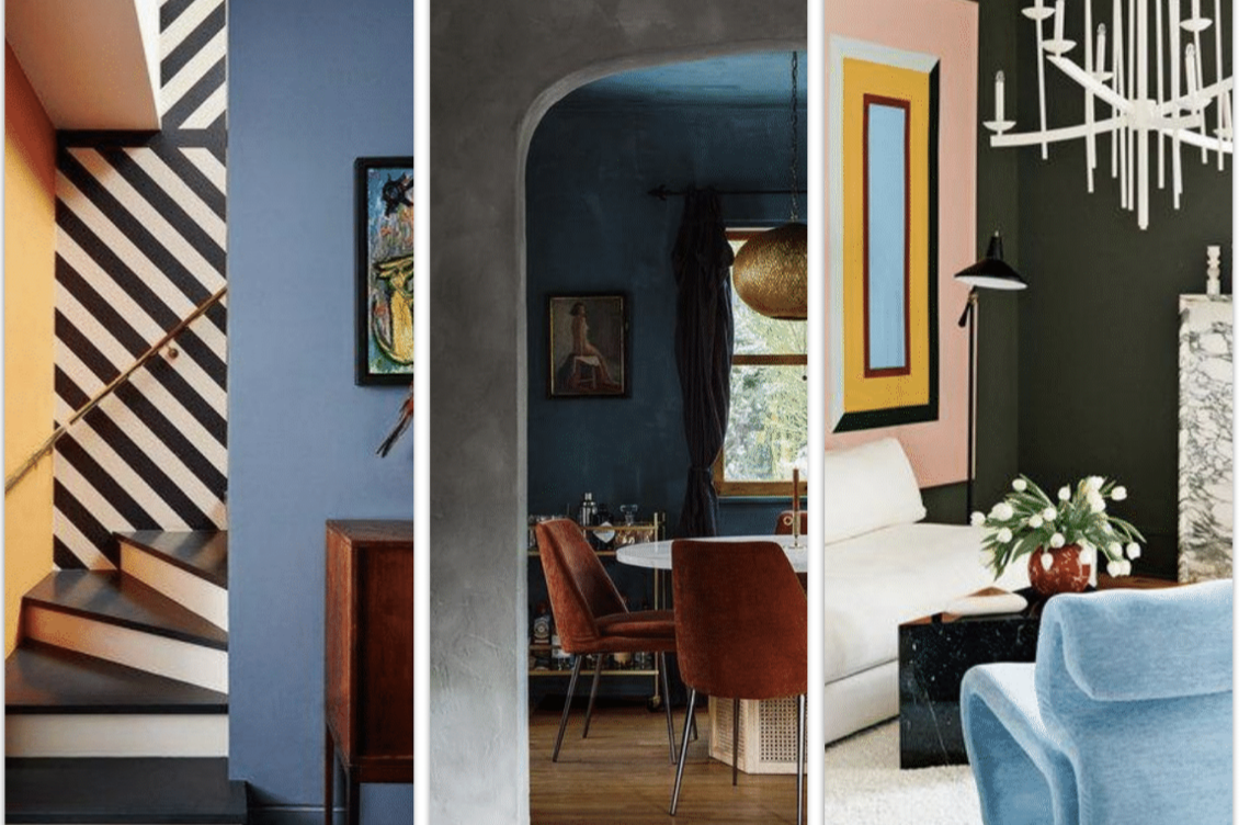
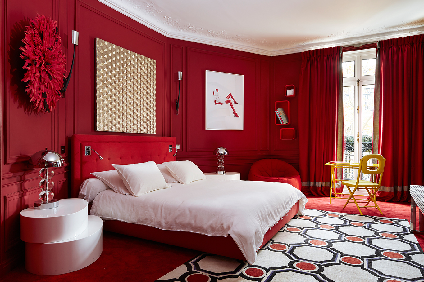
This list (paired with images of stunning color-coordinated interiors) provides a helpful framework in understanding the basic associations at play when designing any room of your home…
RED
While vibrant red can be stimulating, its less-saturated counterpart (pink) can be romantic and playful, even social and soft. Red is most commonly associated with courage, strength, and power. This is the reason we see so many countries’ flags in red and even see professionals donning red in high-stakes situations.
In addition to associations with strength, Chinese culture uses the color red to symbolize luck and good fortune… but when mixed with black, it can be associated with death. So be careful!
When it comes to the home, red is a lively color. It is most used in living room settings… after all, the color itself is invigorating, and that red accent chair or pillow… well, that is sure to start conversations or raise the energy of the room!
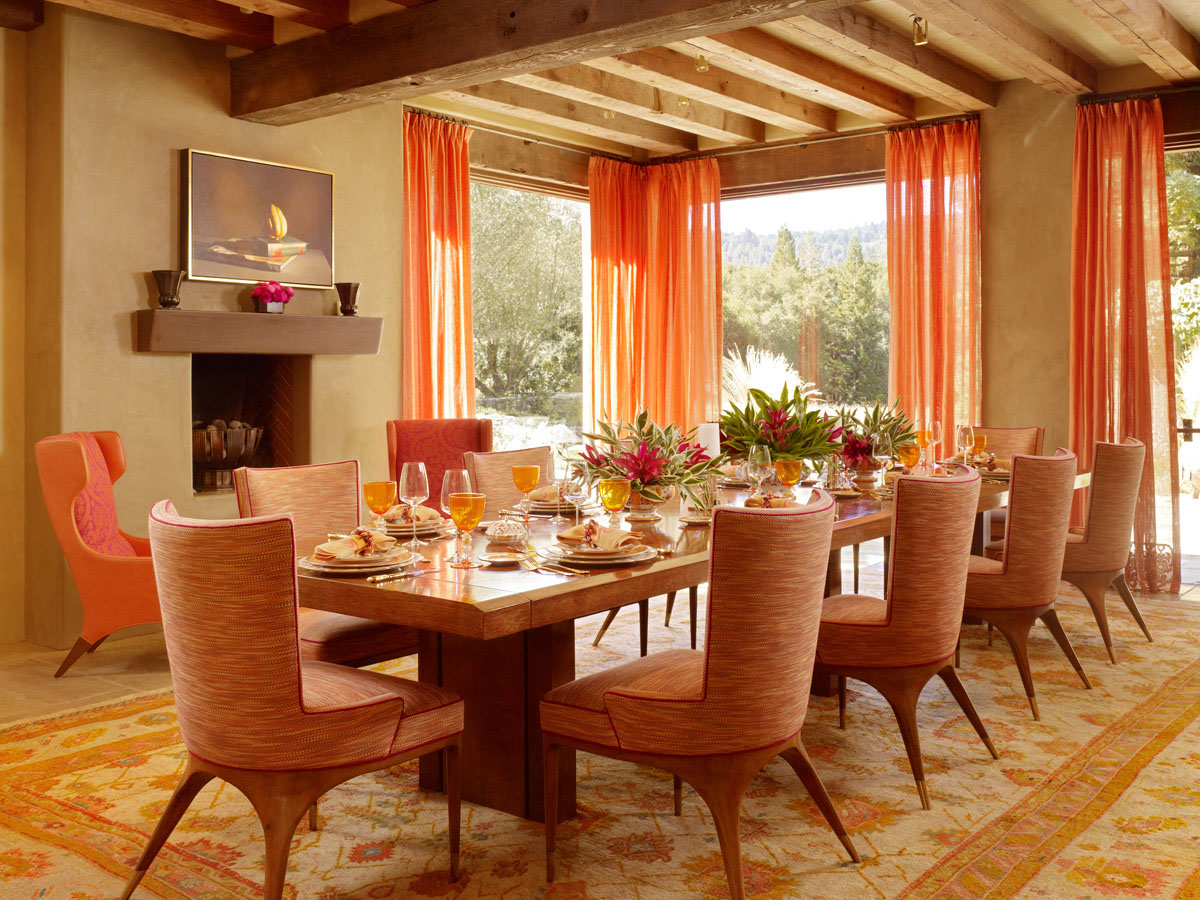
ORANGE
An invigorating and happy color, brighter variations of orange are seen as lively and social while deeper shades of orange, like those found in the natural world feel grounded. Think autumn leaves in Vermont, saffron from India, or the reddish rocks of our very own Laurel Canyon.
Because of its stimulating qualities, orange is a great choice for a home gym or entertaining space, providing motivation and increasing the energy of the space all through color psychology. Ah-mazing!
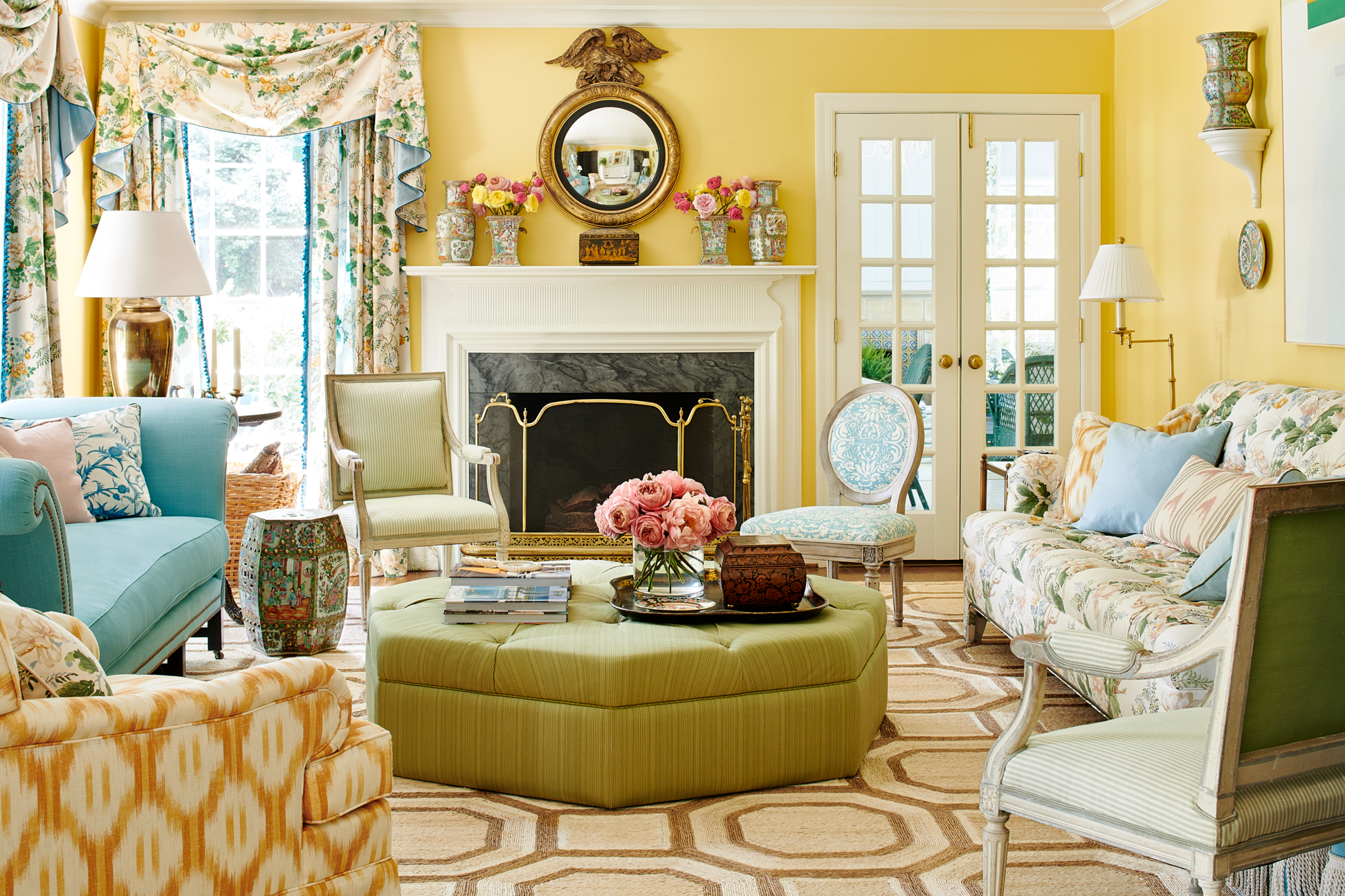
YELLOW
Most commonly associated with cheerfulness and sunshine in Western culture, this vibrant color is often energizing. Deeper shades of yellow, like the golden hue of a sunflower in late summer or a deep ocher, can feel moody and earthy. But be careful… if the yellow gets too muddy, it can evoke feelings of distrust.
Culturally, yellow has various interpretations. In China, yellow is the color of rules. In ancient Egyptian tombs and even in the Taj Mahal, a golden yellow called orpiment is used.
In a home, I’ve seen bold yellows inject joy and playfulness while lighter, buttery tones inject softness into a room, especially when paired with other pastels.
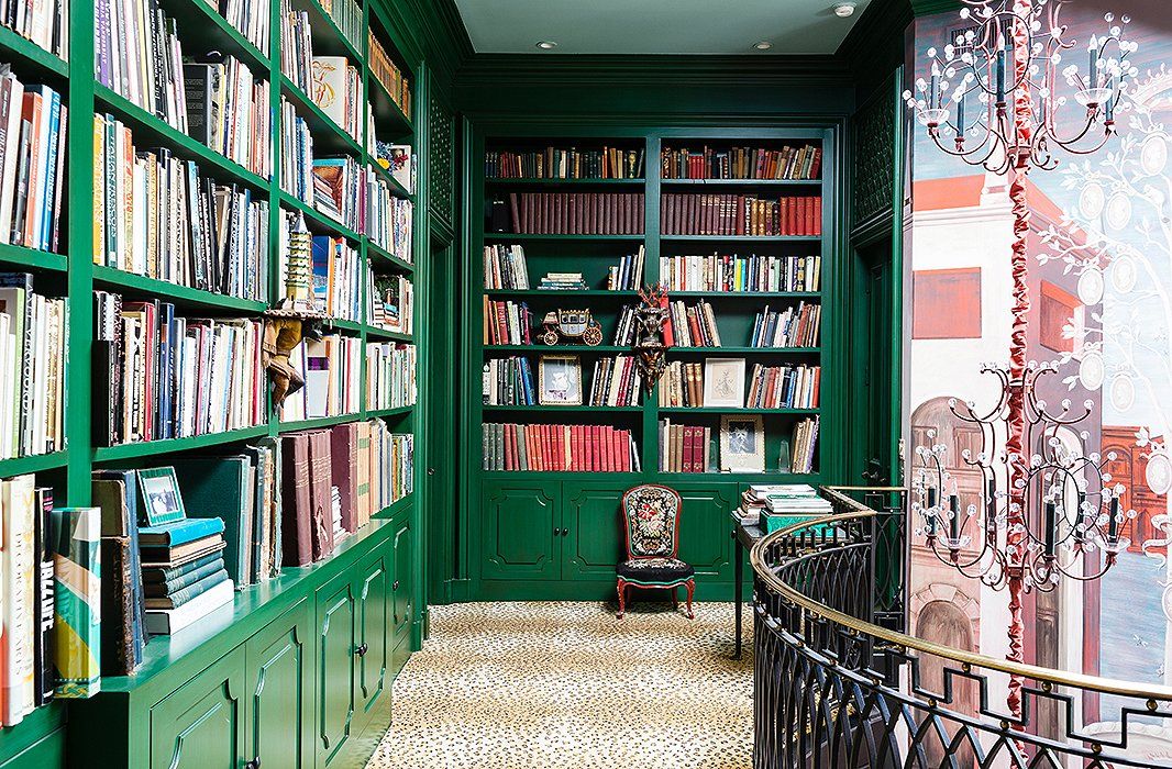
GREEN
Derived from the latin word for life, green is the color found most abundantly in nature. It can represent vitality, harmony, and renewal… but there are so many different tints and shades of green that the emotional impact is equally as varied.
Vibrant shades can be rejuvenating and energizing, while softer shades can be restorative and soothing. Deep forest greens give off calming and secure vibes. A soft olive or sage color has been known to be calming, grounding, and carefree.
Green has also been associated with auspiciousness (such as in India or Ireland), with wealth (US), with peace (ancient Greece), and even with youth (Western cultures).
If you love green, the function of your room and how you want it to feel will help you decide which shade is best…and we should talk! 😉
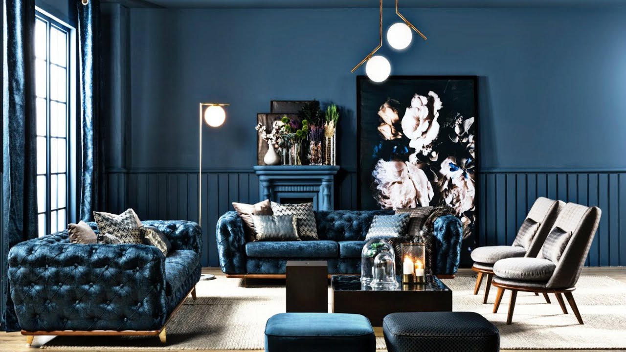
BLUE
There are more shades of blue than any other color, so it makes sense that it can portray a wide range of contrasting emotions. Whether calming and serene, intelligent and pensive, sad and serious, or playful and lively, the associations of blue are expansive and limitless.
In the natural world, blue has been found in gemstones like lapis lazuli and sapphire as far back as the ancient Egyptians, but blue was largely unrecognized as a color until the 1800s (just in time for Picasso’s blue period in the next century).
Because of its dynamic personality, it is probably no surprise that blue is one of the most used colors for homes everywhere…just be sure that the blue you choose for any given room matches the narrative you are trying to tell. Blue has many personalities and the color psychology of the many shades, hues, tints, and tones out there vary drastically!
PURPLE
Historically, purple is the color of royalty and luxury, not because it looks luxurious (though it certainly does now), but mainly because it was so expensive to produce! In the beginning, only royalty could afford to produce it, and some rulers, like Roman Emperor Nero, forbid others from donning the hue. The scamp.
Nowadays, purple still feels indulgent. Deep shades of purple can feel moody, while vibrant shades feel celestial, creative, and inspiring. Softer shades, like lavender and lilac, have a lighthearted, softening effect that is often experienced as soothing.
Because the lighter variations of this color are so calming and peaceful, they are great options for spa-like master bathrooms or nurseries… anywhere that you need a little more space to breathe deeply and relax.

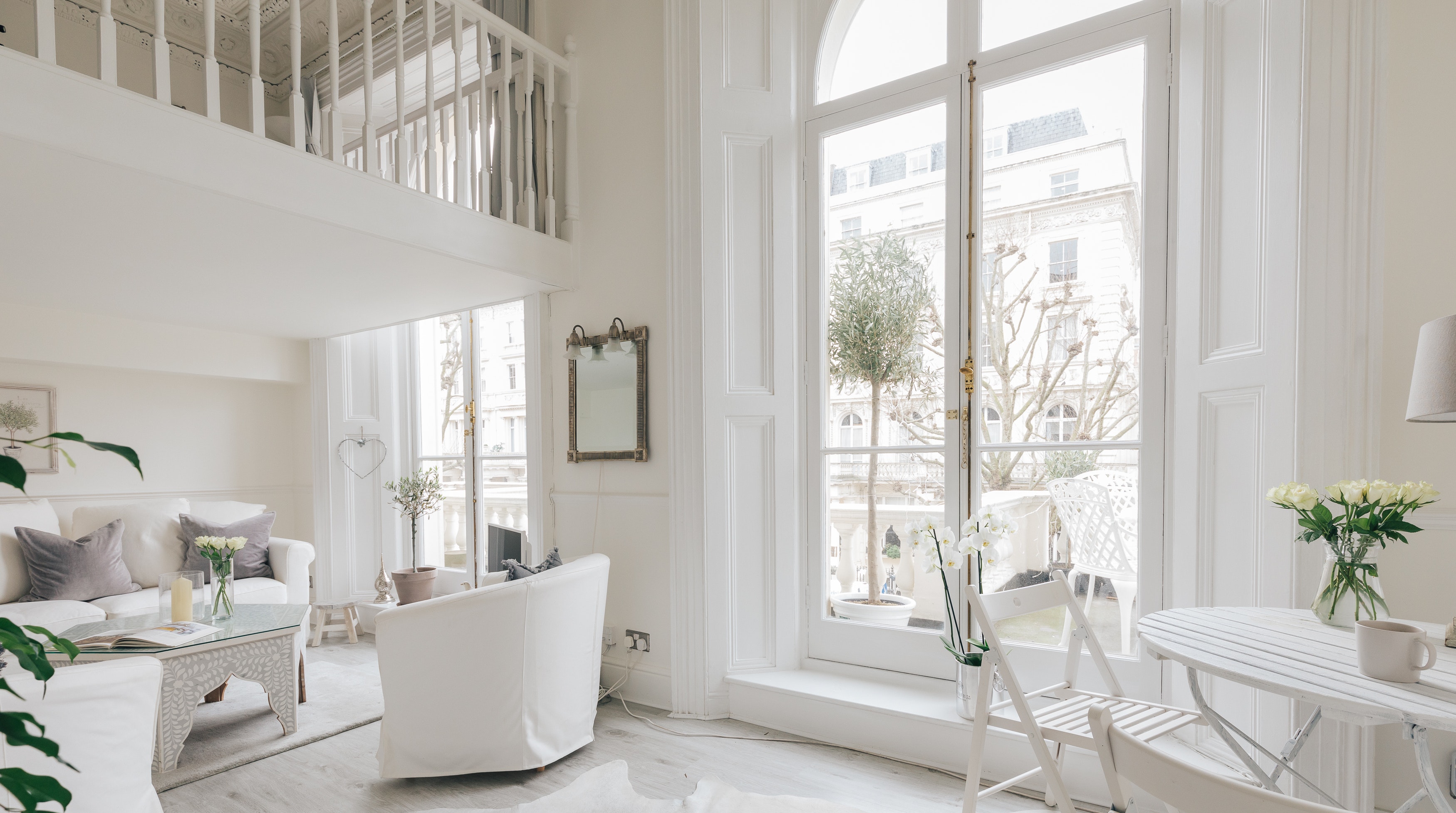
WHITE
In Western cultures, true whites are associated with goodness, innocence, cleanliness, and perfection. Slight variations (think eggshell, ivory, cream) are thought to have a softening effect in a space.
By contrast, white can also be associated with sterility and coldness. In Eastern cultures, like China and Korea, white symbolizes death, mourning, and is often worn to funerals.
When it comes to interiors, white is extremely versatile, and different undertones can create different feelings in your space. If you’re considering white, I highly suggested talking to an interior designer. It is a very difficult color to get right on your own!
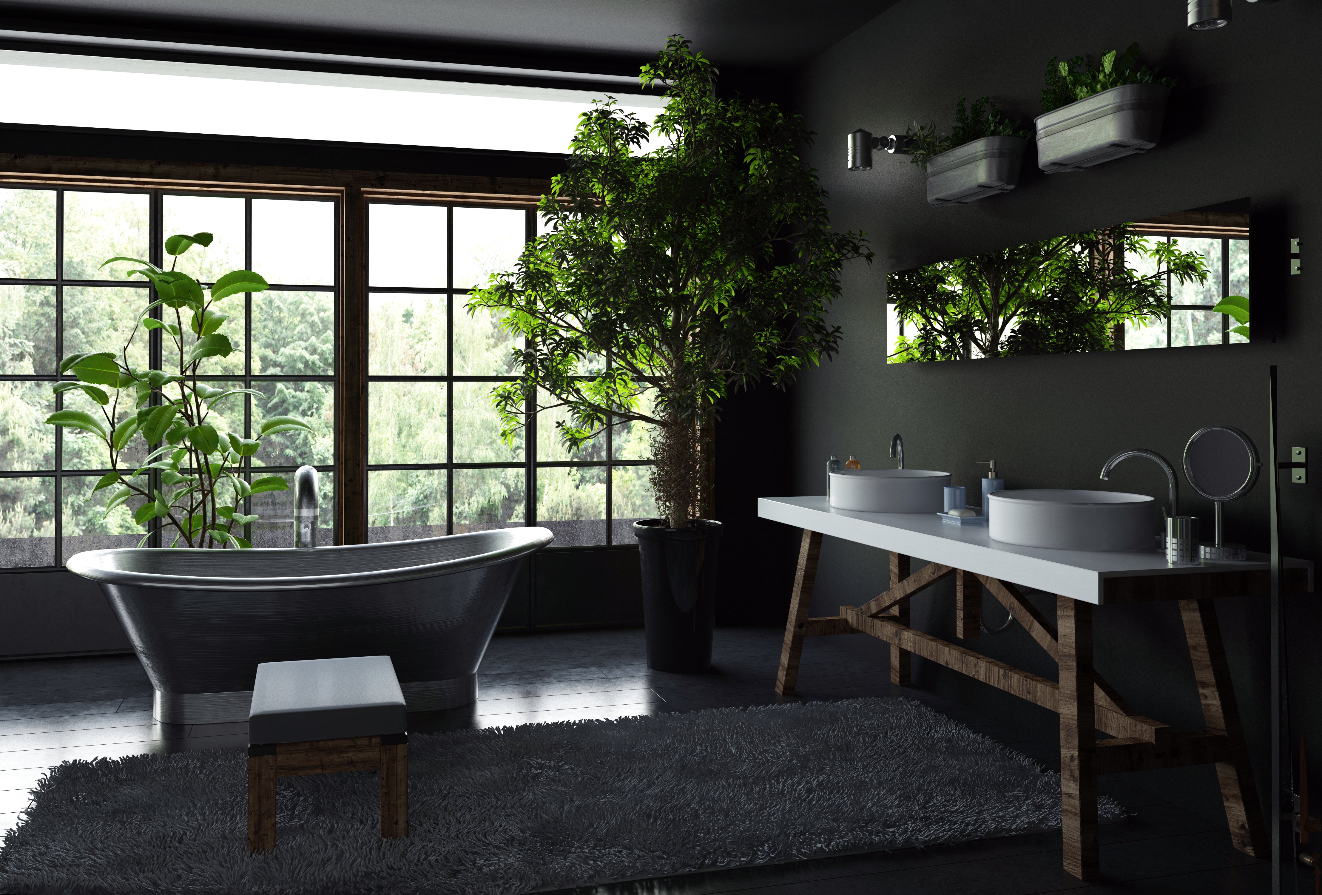
BLACK
Another power color, black has long been associated with elegance and formality… although a hint of mystery can’t help but find its way in as well.
However, black has some contradictory associations, too. In Chinese culture, black is considered unlucky, but in ancient Egypt, black was considered the color of life, most likely because of the dark life-giving earth of the Nile. Fascinating, right?
What can’t be contested is that black is bold, which means we must use it wisely in a home. When done right, it can create a luxurious setting full of drama and contrast that is sure to elevate any home. Can’t you just visualize a high-end cocktail party in your dark and dreamy space?!
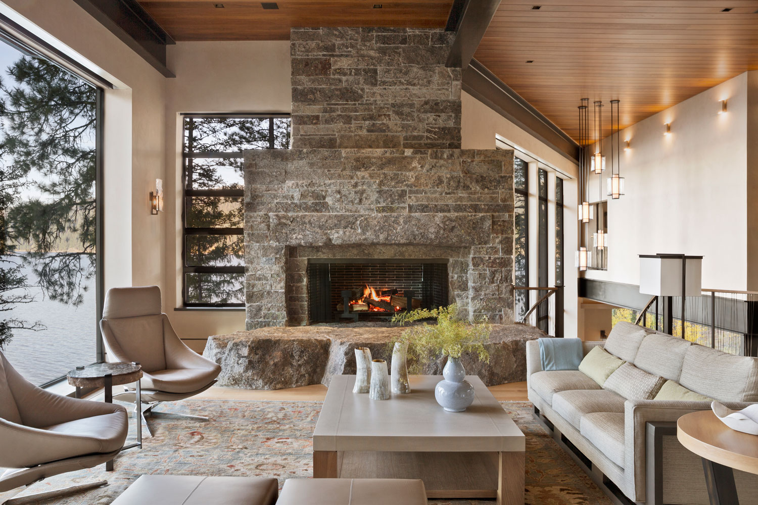
BROWN
Brown is reminiscent of nature and associated with classic taste. Picture an iconic Louis handbag… a classic Burberry scarf… you get the idea. 😉
Brown is a symbol of strength and resilience. It is associated with reliability, security, and even safety. Because this natural color is reliable and trustworthy, it is often incorporated into nearly every room of the home.
Sure, some might choose to paint the walls in a particular room brown, but more often than not, it is the stunning wooden floors flowing throughout and carefully hand-selected wooden furniture that contribute to the grounded feel of a well-designed home. Who knew brown had such wonderful tricks up its sleeve?? Color psychology at its finest!
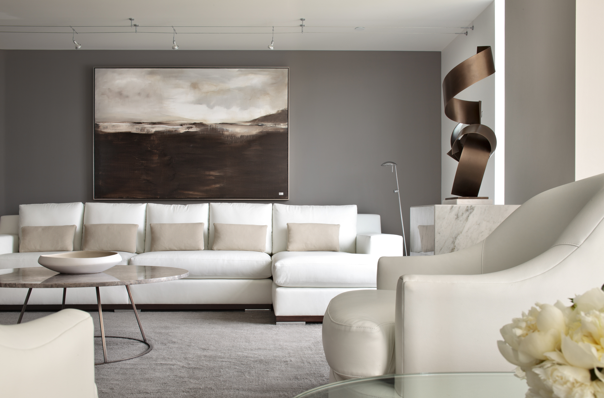
GRAY
Seen as sophisticated and timeless, gray is practical while also slightly moody. Gray is often used to balance a space, as it has a stabilizing effect. Because of this, it really is no shock that gray has been on-trend for years as a wall color, kitchen cabinet finish, and more.
Despite the fact that beige is replacing gray as a go-to wall color, it is still of the most versatile colors, playing well with nearly any palette, grounding a room, and bringing an air of sophistication to any home. Just be sure to pair it with natural materials and other colors to keep the space feeling lively and welcoming!
How to Explore Color Psychology for Your Own Home
Now that you are armed with a general understanding of the associations of color, it is time to apply what you’ve learned to your own home. Are you ready?!
Exploring the colors that speak to you is a simple, yet delightful, 3-step process. This is a process that we will go through together (see more here), but one that you can easily get a head-start on.
STEP 1: Explore
First step? Go out into the world and pay attention to the things that speak to you.
This could mean taking a hike in the woods, or visiting a nearby botanical garden. Notice the colors and textures that draw your eyes… is there a flowering plant in a color that you just love? Or maybe the autumn leaves on the forest floor provide a color palette that speaks your language?
Next… you could visit your favorite store, grab a drink at your go-to bar, have lunch at one of your top 5 restaurants… and while there, think about what brings you back to this location again and again. Are there colors you adore? Is it the environment that has an effect on you? How do you feel when you are there?
Then… reflect on your travels. What countries felt like home or adventure to you? How can you capture the colors, sights, sounds, and feelings that you had abroad and incorporate them into your space? (And if you haven’t done much traveling yourself recently… my 7 Wonders of the Design World post might ignite your imagination.)
Finally, make sure that you are taking notes for yourself as inspiration strikes. This could mean snapping photos and saving them in a “Color Psychology & Inspiration” album on your iPhone. Or writing down your thoughts in your Notes app. Trust me, if you’re looking for inspiration, you certainly don’t want to forget your findings! (And show them to me!!)
STEP 2: Create
With your notes in hand, you can now start virtually designing a space that fits your ideal vibe. How do you do this, you might ask?! Well, Pinterest, of course! I love asking our clients to create Pinterest boards that inspire them. It helps me understand what speaks to you.
First, start by searching out images that align with the items that caught your attention while “researching” in step 1. Then, begin creating boards for specific design elements, such as color and texture, overall spaces, and anything that causes you to pause (and maybe drool a little…).
After all, your space should be one that you love and one that evokes an emotion every time you walk through the room. If it catches your attention and forces a smile while you’re pinning, it very well might be the perfect design element for your home!
STEP 3: Refine
Once you feel that your Pinterest arsenal is nearly full, it is time to start paring down what you like versus what you love.
Remember, the goal of the final product isn’t to create a beautiful space…it is to design a jaw-dropping and mind-blowing space that fills you with joy every single day.
With that in mind, go through your boards and review the images room by room. Look through the inspiration, color, and texture photos through the lens of your living room. What works? What doesn’t work? What excites you? Repeat the process for each room of your home until you start to have a cohesive home color palette with variations by room in mind. Bonus points if you also have a sense of the textures that you just have to have in the space.
At this point, if you feel confident and want to forge ahead, be my guest! This simple process is a great starting point for creating a home that speaks to you and inspires all of the emotions that you desire to experience on a daily basis.
However, if you’d love a professional to take your findings and create your to-die-for home, this a great time to call a designer. We can take it from there! (If you’re wondering how a designer crafts the perfect color story for your home, my post about that very topic might be helpful.)
Whether the associations and psychology of color are brand new to you, or a concept you’ve been playing with for years, the fact remains that color psychology is an important tool that must be used wisely in every home. Understanding the meaning of each color and how it impacts you is the first step toward creating a stunning space that brings you joy, comfort, elegance, and the lifestyle you love.
Whether your vibe is peaceful and serene, invigorating and lively, professional and sophisticated, or a combination thereof, I would be honored to create your uniquely beautiful, colorful, and personal space.
Let’s make design magic together.
Cheers,
– Rydhima